Customizing Appearance
By default, Image Uploader has the appearance of a standard Windows control. But sometimes you may want to customize its appearance to integrate it with your page design more closely. Besides, you can display your custom buttons, or even make your own progress bar. This topic outlines what you will need to achieve this.
In this topic:
Image Uploader Appearance Settings
The figures below demonstrate what elements of Image Uploader can be changed and what properties are responsible for the changes. If you click the property name, you will get to the reference description of this property.
Appearance customization parameters take effect only if the UseSystemColors
property is false.
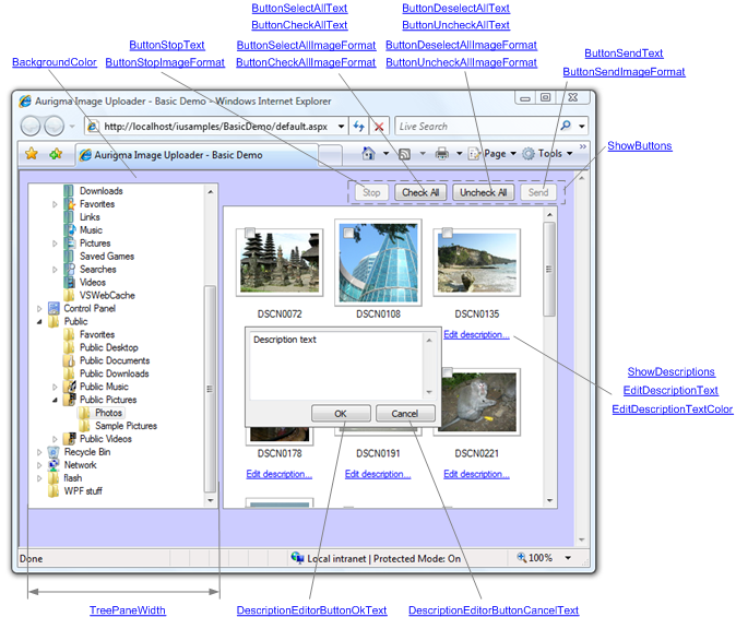
Two Panes Layout
The following screenshot shows Image Uploader with the two panes layout. In this mode, you can change the settings of the tree pane and the folder pane. To customize the tree pane (on the left), you may change its width and background color. To customize the folder pane, you may specify:
- Its background color.
- Whether to show the buttons on the top and a context menu.
- What text and in what color to display where needed.
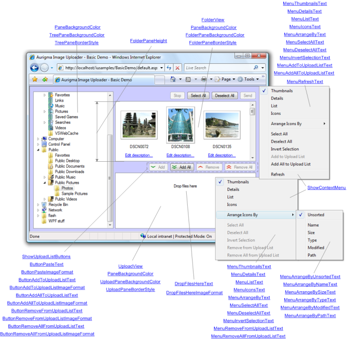
Three Panes Layout
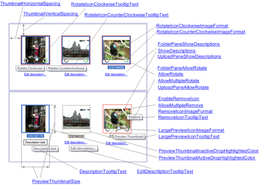
The screenshot below shows Image Uploader with the three panes layout. When using this layout, for the folder pane, you may specify its height in addition to the settings mentioned above. To customize the upload pane (on the bottom), you may specify:
- Its background color.
- The image displayed when no files are selected for the upload.
- Whether to show the buttons on the top and a context menu.
- What text and in what color to display where needed.
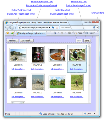
One Pane Layout
This screenshot shows the one pane layout of Image Uploader. This layout consists only of the upload pane with no properties, specific to this mode.
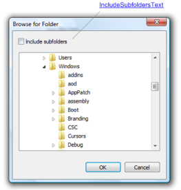
Browse for Folder Dialog
This dialog appears in one pane layout mode when the user clicks the Add Folder button.
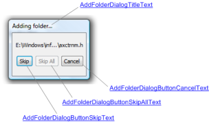
Adding Folders Dialog
This dialog displays folders that are being added for upload.
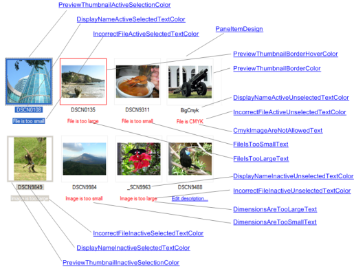
Thumbnail View
The thumbnail view can be used in the folder pane and in the upload pane. You can change the size of the displayed thumbnails, the spacing between them, and different text labels appearing depending on the other settings.
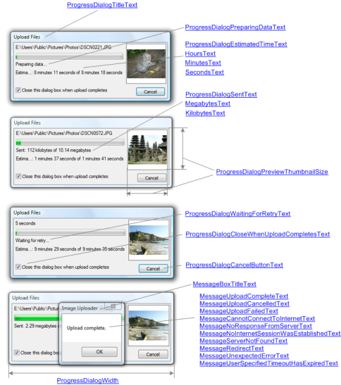
Progress Dialog
This is a standard progress dialog that appears during upload. It consists of a progress bar, status information, and a thumbnail of the image being uploaded.
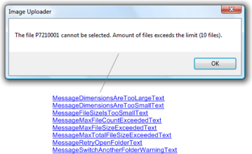
Message Box
This dialog appears whenever some error occurs, or when a warning message should be displayed for the user.
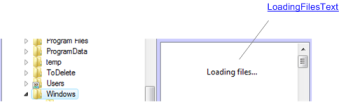
Loading Files
If a folder selected in the tree pane contains too many items, it may take some time to create the full list of the files. While this operation is in progress, the corresponding text message will be displayed to the user.
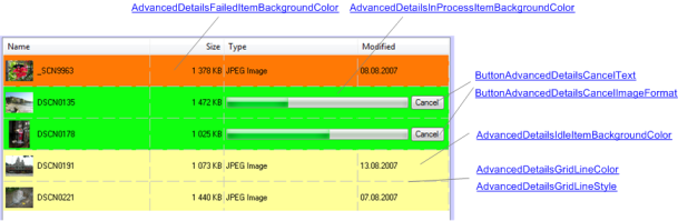
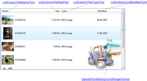
Advanced Details List
This view mode is available for the upload pane and shows the details of the upload process. You can specify the background settings of the upload pane and different items, and change the text labels.
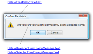
Confirm File Delete Dialog
The dialog that appears in Java version of Image Uploader and asks the user to confirm that they really want to delete uploaded or selected files.
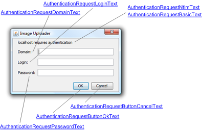
Authentication Dialog
The dialog that appears in the Java version of Image Uploader when the user should enter their credentials.
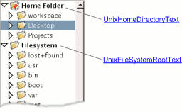
Unix File System
The tree pane on *NIX operating systems is slightly different from the tree panes on other systems. For *NIX users, you can change text that labels the home directory and the root directory.
Specifying Parameters of Image Uploader
The most convenient way to change the default value of a property is to use the addParam functions declared in the iuembed.js when initializing Image Uploader. For example:
<script type="text/javascript" src="iuembed.js">  </script>
<script type="text/javascript">
var iu = new ImageUploaderWriter("ImageUploader", 710, 500);

//...Any other params...

iu.addParam("BackgroundColor", "#ff0000");
iu.addParam("PreviewThumbnailSize", "150");

//...

iu.writeHtml();
</script>
See the Configuring Image Uploader topic for more details.
You can also change properties in runtime. However, it is convenient only if you create the control dynamically or need to change appearance on-the-fly, for example, as a response to some user actions.