Customizing Appearance
The figures below demonstrate what elements of Image Uploader Flash can be changed and which properties are responsible for the changes. If you click the property name, you will get the reference description of this property.
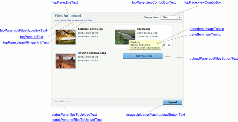
Image Uploader Flash Layout
The following screenshot demonstrates Image Uploader Flash layout. Here it is shown how to carry out the changes:
- Top Pane labels;
- Change view box items;
- Upload Pane button and tooltips;
- Status Pane elements.
View Modes
There are three view modes intended to browse user-selected files in a more convenient way.
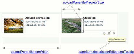
Tiles View
In this view files appear as thumbnails (or icons for non-image files) with a file name and details. Here you can set the tile width and the thumbnail dimensions.
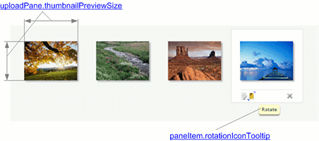
Thumbnails View
This view displays thumbnails (or icons for non-image files) only. Thus, only the thumbnail dimensions can be modified.
Icons View
In this view files appear as small icons with names on the right. Here it is available to change the width of the Upload Pane item (including an icon and file name) and the size of square the icon is inscribed in.
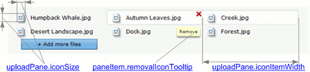
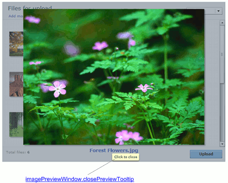
Image Preview Window
This screenshot shows Image Preview window which appears whenever a user double-clicks an image item in Upload Pane. Here you can modify a tooltip displaying when the Image Preview window is shown and the mouse pointer hovers over the Status Pane.
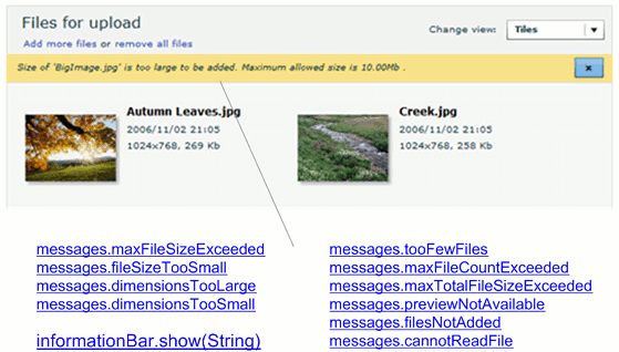
Information Bar
These messages are displayed when a user tries to add a file which does not meet the specified restrictions.
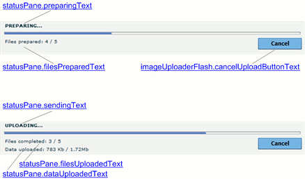
Progress Details
The screenshot below demonstrates the Status Pane during the upload process. Here you can change labels containing upload details and the button which terminates the upload.
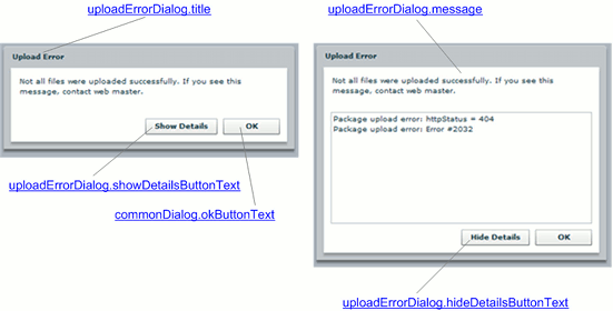
Upload Error Dialog
This dialog appears whenever some upload error occurs.