Customizing User Interface
To customize Photo Kiosk user interface run Configuration Tool and select Appearance from the tree on the left. This section contains general settings and a subsection for each Photo Kiosk screen. In each subsections you can set images displayed as headers and backgrounds, and also main banner for the Welcome screen. General settings allow to specify Photo Kiosk theme and localization file. Photo Kiosk theme is a XAML file with application resources defining appearance settings. Photo Kiosk distribution package includes an alternative theme (SilverTheme.xaml). You can use this theme as is, or as a template to create your own one.
The figure below demonstrates customizable elements of Photo Kiosk interface. Dotted frames show areas intended for placing headers and the banner.
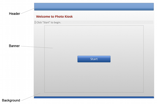
Photo Kiosk displays headers and the banner in their actual size, and you should draw custom banners in accordance with screen resolution of your kiosk.
Pay attention that header image should be 96 dpi; otherwise, the image will not be displayed correctly.
Suppose, your kiosk is equipped with 1280 x 1024 pixels monitor, then the images should be of the following sizes:
- 1042 x 712 pixels for the main banner
- 1270 x 82 pixels for headers in the screens without the Cancel order button
- 1010 x 82 pixels for headers in the screens with the Cancel order button
Contrary to headers, Photo Kiosk fits background images; thus, if the specified background image is bigger or smaller then Photo Kiosk background, it will be shrunk or stretched not preserving the aspect ratio. Therefore, it is recommended to use background images of the same size as your kiosk screen resolution.
Transparency is supported for all header, banner, and background images giving you the ability to customize Photo Kiosk appearance, as well as display advertisement and the other important information to your clients.